A long-term digital growth companion that guides students aged 13–17 from career confusion to
confident, informed decisions — while actively protecting their mental well-being.
Chapter 1

A career space for young minds
Building a More Thoughtful Student Journey
Chapter I is a digital growth companion designed for students aged 13–20 navigating academics, identity, and future career decisions. The platform helps students move from confusion and external pressure toward clarity and confidence through personalized guidance, self-discovery, and structured growth journeys. Built around both ambition and emotional well-being, Chapter I combines mentorship, career exploration, and reflective support into a single experience. It aims to help students better understand themselves, make informed decisions, and grow with confidence during some of the most important formative years of their lives.
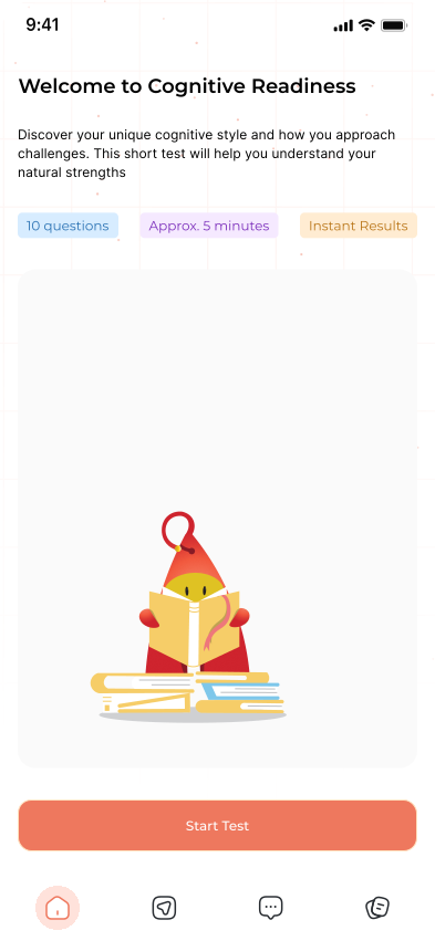
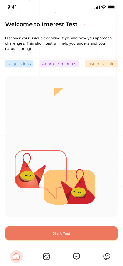
Defined the overall product experience and interaction strategy for Chapter I, focusing on creating a platform that feels intuitive, engaging, and trustworthy for younger users. Worked on simplifying complex decision-making journeys into clear, structured experiences that encourage exploration without overwhelming the user. Led the UX direction across core flows, visual systems, and platform structure while ensuring consistency, accessibility, and long-term scalability. The role involved bridging user psychology, product thinking, and interface design to shape a more thoughtful and human-centered digital experience.
- 1 Product Designer
- 1 Lead
- 1 Stakeholders
- 1 Content Writer
- 3 Developers
My goal was to help translate Chapter I's vision into a supportive
and approachable digital experience — structuring the platform in
a way that makes growth, career, and decision-making feel clearer,
less overwhelming, and more accessible for
students.


Context & Problem
(01)Understanding the Space
Students in India are expected to commit to a career direction as early as Class 10 — often at 14 or 15 years old. The standard process: sit a board exam, pick a stream (Science / Commerce / Arts), and implicitly select a career path. Most do so with limited self-knowledge, minimal exposure to the real world of work, and significant pressure from family, peers, and society.
Career guidance products exist, but they're almost entirely built around one-time personality tests. Students complete a questionnaire, receive a PDF report listing three career options, and are expected to act on it. The problem isn't a lack of tools. It's that the tools don't match the reality of how students actually develop self-awareness: gradually, non-linearly, and with a lot of emotional noise in the background.
Five Interconnected Problems
Premature Decision-Making
Students must commit to a stream at 14–15, before they have the life experience to understand their own strengths, interests, or the real nature of different careers.
One-Time Testing Paradigm
Existing tools treat career guidance as a single event (a test), not an ongoing developmental process. One report cannot capture how a student evolves across months.
Emotional Pressure, Zero Support
The decision-making period is one of the most stressful in a student's life. No existing product monitors or supports mental well-being during this process.
Surface-Level Career Information
Students are told to 'be an engineer' but never shown what an engineer actually does on a Tuesday afternoon. There is a total absence of lived-reality career content.
Parent-Student Misalignment
Parents apply pressure based on social norms, not their child's demonstrated strengths. No product bridges this communication gap constructively.
The Opportunity
The gap isn't information — students can Google any career. The gap is structured self-discovery over time, emotional support during transitions, and a product that treats career guidance as a journey, not a test.
"Students engage more with exploration and discovery than with evaluation. The product had to feel like a companion, not an examiner."
My Design Approach
My approach focused on simplifying complexity. Since the platform involved multiple engines, automation logic, and system integrations, the goal was to structure the experience in a way that feltintuitive while still supporting powerful capabilities. I prioritized clarity in workflows, modular system thinking, and scalable design patterns so the product could evolve as the platform grew.
Research & Discovery
(02)Research Methodology
A mixed-method approach across three weeks was employed, combining primary qualitative research with competitive landscape analysis. The goal was to understand not just what students do, but what they feel during the career decision process.
Five Interconnected Problems
| Sl.No | Method | Sample | Objective |
|---|---|---|---|
| 01 | In-depth student interviews | 20+ students, Class 9–11 | Emotional journey, pain points, vocabulary |
| 6 parents | |||
| 02 | Parent interviews | Expectations, pressure dynamics, communication | |
| 4 school counsellors | |||
| 03 | Educator interviews | Institutional perspective, tool limitations | |
| 9 products | |||
| 04 | Competitive audit | Feature gaps, UX patterns, positioning | |
| 4 students, 10 days | |||
| 05 | Diary study | Daily emotional rhythm and engagement habits |
Key Interview Qoutes
“I took the career test and it said I should be an
accountant. I hate maths. I just closed the tab.”
“My parents keep asking about my future plans but I don't
even know what I'm good at yet. It stresses me out."
"I wish someone would just show me what different
jobs actually look like day-to-day. Not just the name."
"Every career test feels like a trap. Like there's
a right answer I'm supposed to give."
Competitive Analysis
Competitor Analysis
| Product | Core Model | Well-being Support | Gap |
|---|---|---|---|
| Benchmark Platform A | Assessment + counsellor match | None | One-time, no longitudinal tracking |
| Benchmark Platform B | Psychometric test + report | None | PDF report, no ongoing engagement |
| Benchmark Platform C | Information portal | None | No personalisation or emotional layer |
| Benchmark Platform D | Career exploration games | Minimal | Not India-contextualised |
| Benchmark Platform D | Mindfulness app | Strong | No career component |
No existing product in the Indian market combines ongoing career exploration with emotional well-being support. The competitive whitespace is clear.
What We Learned from Research
- •Students lack vocabulary to describe their own interests; they need structured prompts, not open-ended questions.
- •Emotional state directly affects engagement: students disengage from career tasks during exam stress periods.
- •Parents want involvement but don't know how to support without pressuring.
- •'Day in the life' content is the single most requested format — students want reality, not job titles.
- •Short, frequent interactions outperform long assessment sessions for sustained engagement.
- •Mascot-based companions significantly reduce perceived judgement in early testing sessions.
Moodboard & Design Direction
(03)Visual Direction
Before touching Figma, the emotional territory the product needed to occupy was defined. Research showed that career guidance tools feel intimidating so the visual language had to do the opposite: feel warm, curious, approachable, and personal.
Reference products were studied across three categories: consumer wellness apps (for emotional warmth), educational companions (for curiosity-forward tone), and personal finance apps for young adults (for structured trust without formality).
Four Emotional Territories Explored
Competitor Analysis
| Territory | Reference Apps | Tone | Decision |
|---|---|---|---|
| Warm & Safe | Headspace, Calm | Soft, nurturing, pastel | Too passive for career context |
| Curious & Playful | Duolingo, Khan Academy | Energetic, gamified, bright | Too childish for 13-17 age range |
| Structured Trust | Robinhood, Cleo | Confident, clean, purposeful | Too corporate, lacks warmth |
| Companion Intelligence | Notion, Readwise | Smart, personal, calm confidence | Selected — hit the right balance |
The 'Companion Intelligence' territory was selected as the foundation: intelligent enough to be trusted,warm enough to be approachable, and calm enough to reduce rather than add to student anxiety.
Branding and Visual Identity
(04)Brand System
The brand needed to communicate curiosity, trustworthiness, and emotional warmth simultaneously. A young student opening this app for the first time should feel: 'this is for me, and it won't judge me.'
Colour Palette
| Colour | Hex | Role | Rationale |
|---|---|---|---|
| Coral Orange | #EE785E | Primary / Brand | Warm and encouraging tone that feels approachable for students while still energetic enough to represent motivation, growth, and progress. |
| Soft Peach | #FFF5F3 | Secondary Accent | Adds warmth to the interface without overwhelming the UI, helping maintain a friendly tone while supporting the primary color. |
| White | #FFFFFF | Background | Keeps the interface clean and breathable, ensuring focus stays on learning modules, tasks, and guidance content. |
| Card White | #F6F6F6 | Surface / Cards | Creates subtle separation between UI sections while maintaining a soft, low-contrast layout that feels calm and readable. |
| Cool Gray | #757575 | Sub-Text (Description) | Provides clear hierarchy for supporting text such as descriptions and hints without competing with primary content. |
| Soft gray | #E0E0E0 | Strokes and Boundaries | Defines component boundaries and structure while remaining visually lightweight and unobtrusive. |
| Charcoal - Black ( Blue Undertone) | #292D32 | Texts and Icons | Offers strong readability while remaining softer and more comfortable to read than pure black. |
The color system centers around Coral Orange (#EE785E) as the primary accent. The tone sits between warmth and energy, creating a sense of encouragement without feeling aggressive or overly competitive. For a career discovery product aimed at students, this balance is important; the interface should feel motivating while still remaining approachable and supportive.
The surrounding palette intentionally leans toward soft neutrals and muted grays, allowing the primary color to guide attention without overwhelming the interface. This helps maintain clarity across learning modules, assessments, and daily guidance tools where readability and calm visual structure are essential.
Bright, highly saturated colors were deliberately avoided to ensure the product does not feel childish for the 13–17 age group, while still maintaining a friendly and emotionally supportive tone. The combination of warm accents and restrained neutrals allows the interface to feel encouraging, modern, and focused on personal growth rather than pressure or performance.
Typography
| Typeface | Usage | Rationale |
|---|---|---|
| Montserrat - regular | Body text, descriptions, supporting information | Highly readable and neutral, making it ideal for longer content such as explanations, guidance text, and informational sections without adding visual fatigue. |
| Montserrat - Medium | Section titles, UI labels, navigation, key actions | Provides slightly stronger emphasis while maintaining clarity, helping users quickly scan sections and understand interface hierarchy. |
| Montserrat - semibold | Headings, feature highlights, primary UI emphasis | Creates clear visual hierarchy and confidence in key areas of the interface, guiding attention to important actions and content. |
Mascot Design Principles - AIM
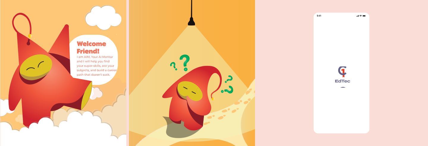
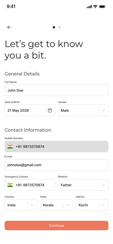
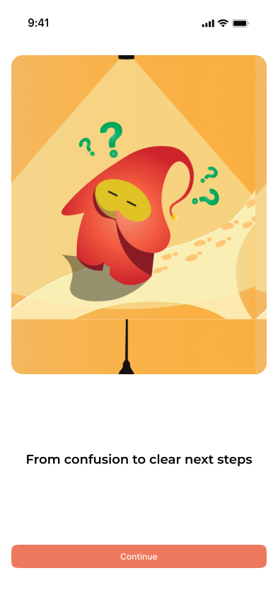
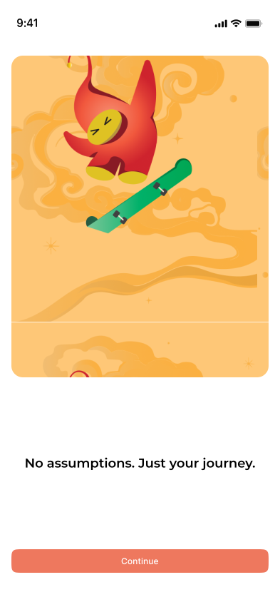
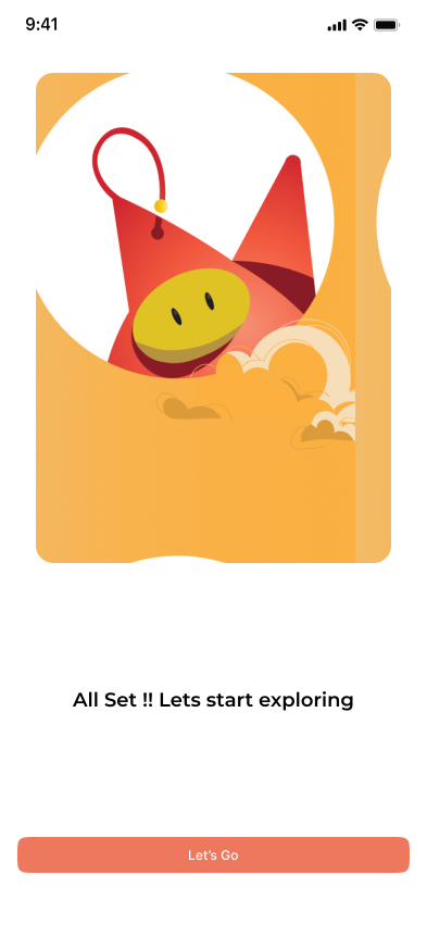
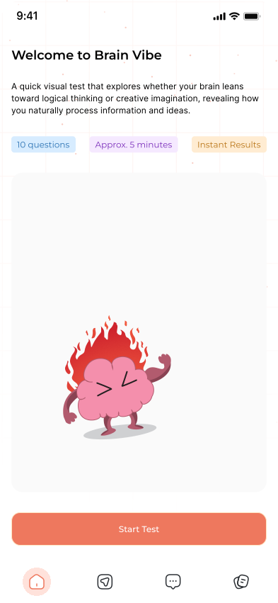
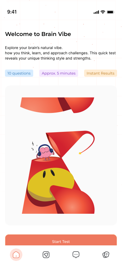
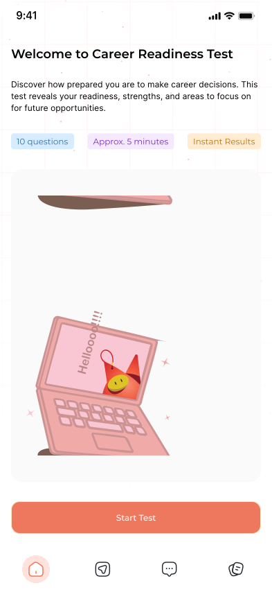
The mascot — AIM — was developed as a friendly guide that accompanies students through their career exploration journey. The concept evolved through collaborative exploration with the illustrator, focusing on creating a character that feels approachable, expressive, and universally relatable. Rather than functioning as a typical gamified character, AIM acts as a subtle mentor that appears at key moments to guide, encourage, and celebrate progress.
The direction focused on keeping the character abstract, gender-neutral, and emotionally expressive, allowing students to interpret it naturally without cultural or identity barriers. Through multiple iterations and visual explorations, the character's shape, movement, and expressions were refined to convey curiosity, encouragement, and celebration — reinforcing the product's goal of making career discovery feel supportive rather than intimidating.
- •Abstract, playful design — AIM uses a soft, rounded shape and expressive body language to communicate emotions without relying on complex facial features. This keeps the character universally relatable and easy to interpret across cultures.
- •Gender-neutral and culturally neutral — The character avoids human traits, ensuring it feels inclusive and approachable for students from diverse backgrounds.
- •Emotion-based states — AIM communicates through simple expressive poses such as curious (exploration), thinking (decision moments), supportive (guidance prompts), and celebratory (progress or achievements).
- •Context-driven presence — AIM appears during onboarding, discoveries, achievements, and reflection moments rather than constantly staying on the screen, ensuring the interface remains focused and distraction-free.
- •Mentor-like conversational tone — AIM communicates in a supportive, friendly voice such as “Hey, I found something interesting based on what you like...” making the interaction feel personal rather than instructional.
- •Soft motion principles — Movements are designed to feel light and friendly, with smooth transitions and gentle entrances so the character enhances the experience without feeling intrusive.
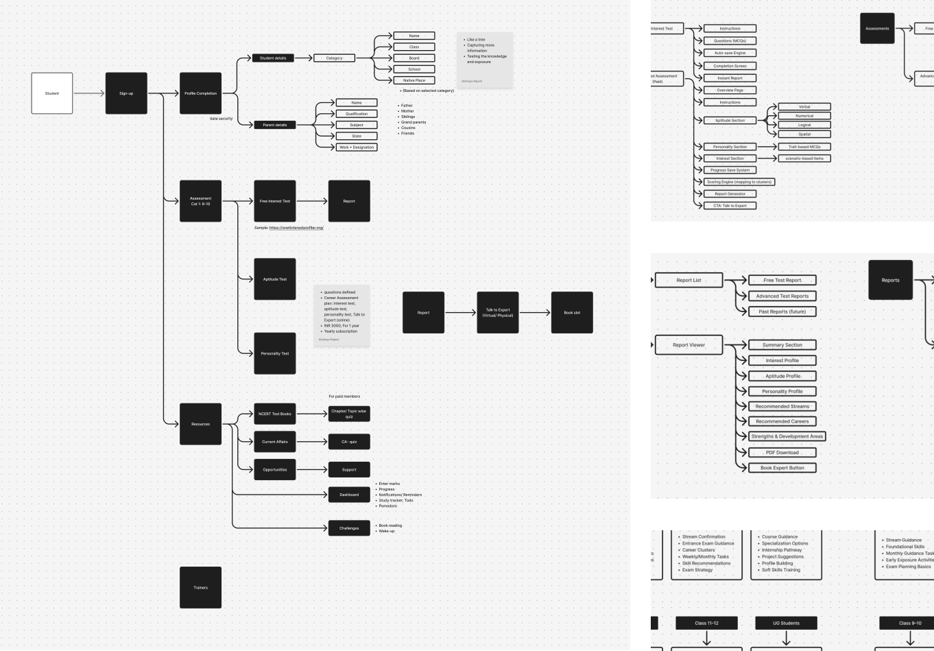
Information Architecture
(05)Before designing any screens, the full information architecture was mapped to ensure every feature had a clear home, and that the navigation model matched how students actually think about their day — not how features are categorized internally.
Feature Prioritisation
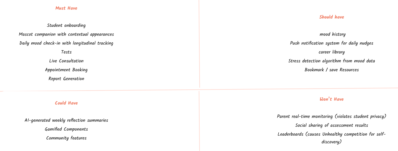
MoSCoW Prioritisation
With a single-quarter timeline and a 0-1 scope, prioritization was critical. MoSCoW was used to align with stakeholders on what ships in v1, what's planned for v1.1, and what goes into the future roadmap.
Navigation Structure — Four Primary Tabs
| Tab | Icon Concept | Primary Concept | Secondary Concept |
|---|---|---|---|
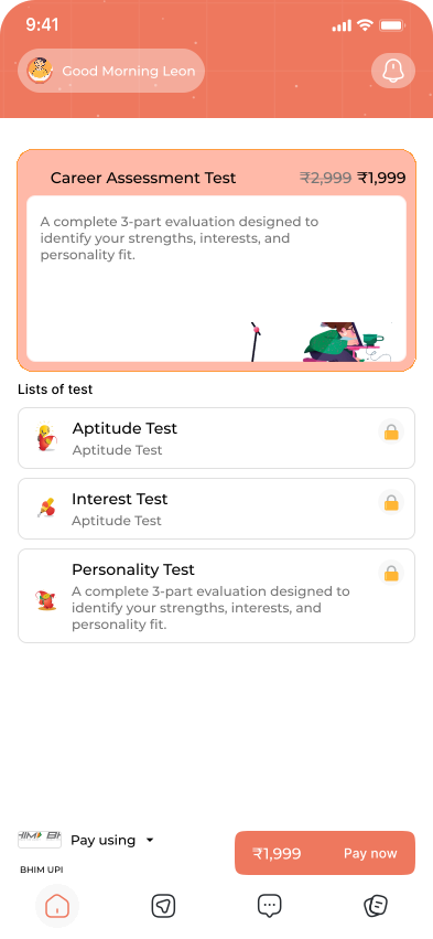
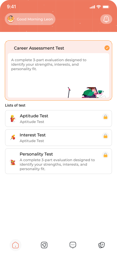
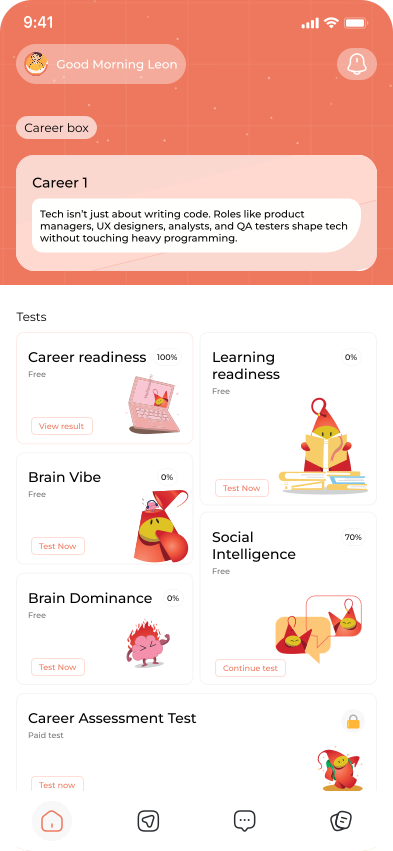
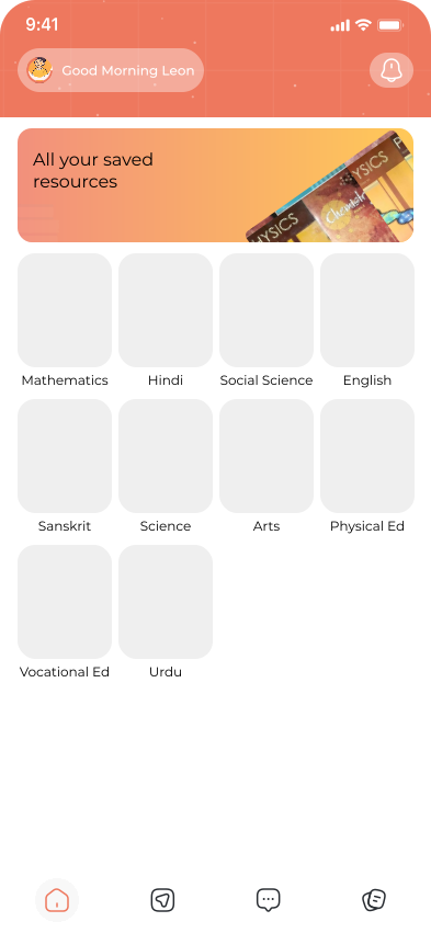
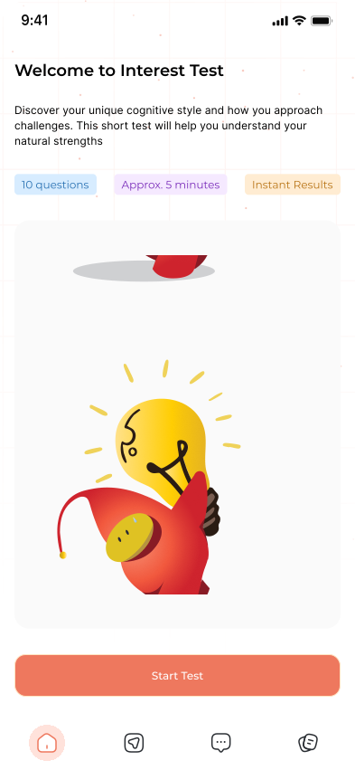
| Home | House | The main dashboard where students receive personalized prompts, test cards, and daily activities tailored to their class and interests. | Encourages daily engagement through features like the Pomodoro timer, mood check-ins, and a flash card that reveals a new career insight each day. |
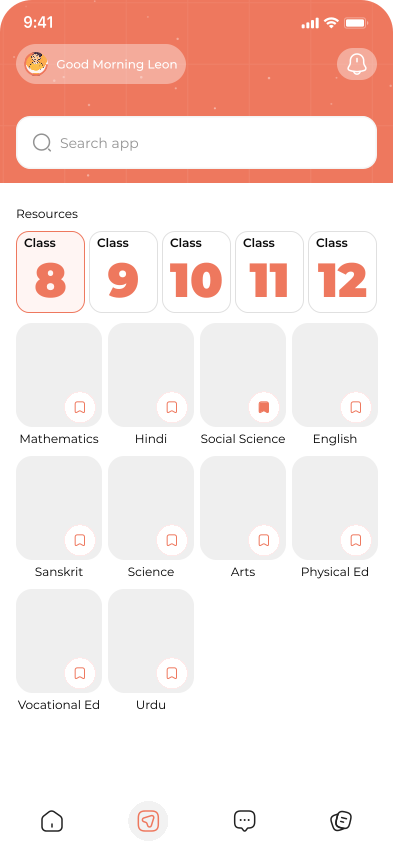
| Explore | compass | A structured space where students can browse subject-wise learning resources and materials relevant to their academic level. | Helps students quickly access curated resources across subjects without overwhelming them with unnecessary options. |
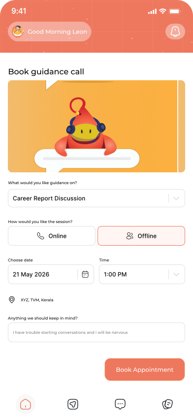
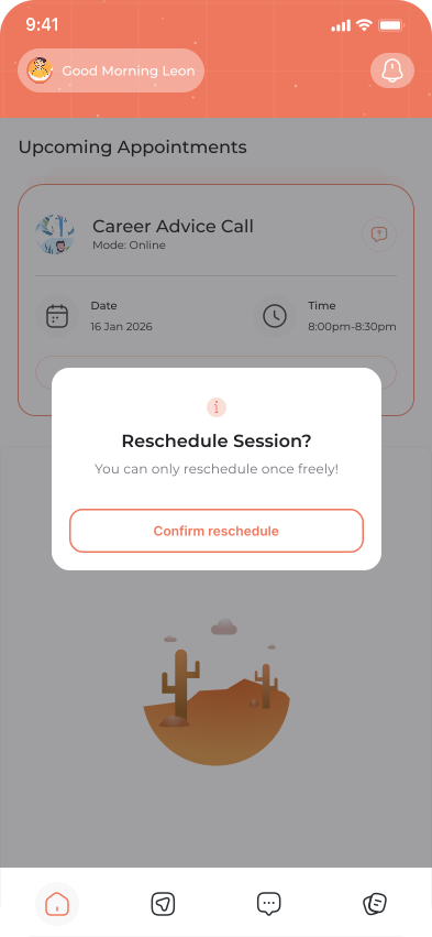
| Consultation booking | Conversation bubble | Allows students to schedule guidance sessions with mentors or counselors for career-related support. | Provides a human layer of assurance alongside the app's digital guidance and assessments. |
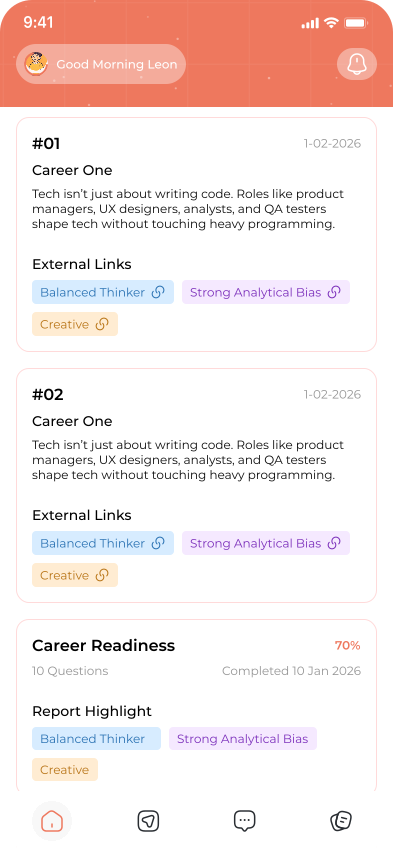
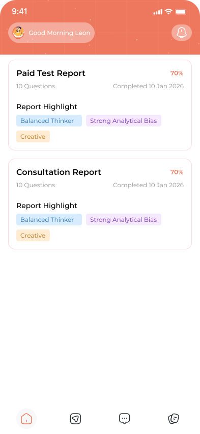
| Reports | Progress document | Displays structured reports based on completed tests, interests, and behavioral patterns. | Helps students and parents understand strengths, weaknesses, and possible career directions. |
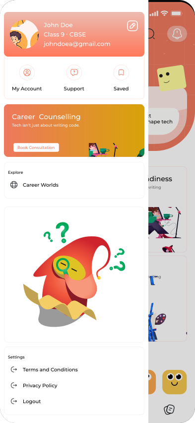
Early exploration used a hamburger navigation. Two rounds of feedback revealed students found it 'hidden' and stopped exploring secondary features. Switching to a persistent bottom tab bar (4 items max) increased feature discoverability significantly in the next round of feedback sessions.
Navigation Decision Rationale
| Option Tested | User Feedback | Decision |
|---|---|---|
| Hamburger menu | 'Hidden', I forgot those features existed | Rejected — hides secondary content |
| 5-tab bottom bar | Too many options, felt overwhelming | Rejected — cognitive overload for younger users |
| 4-tab bottom bar | 'Easy to understand, I know where everything is' | Selected — optimal balance of reach and clarity |
Parent Dashboard — Separate Architecture
Parents access a separate, distinct view — not a parent-mode toggle on the student account. This is an intentional architectural decision: students should feel their app is truly theirs, not monitored by a parent-accessible account sharing the same interface.
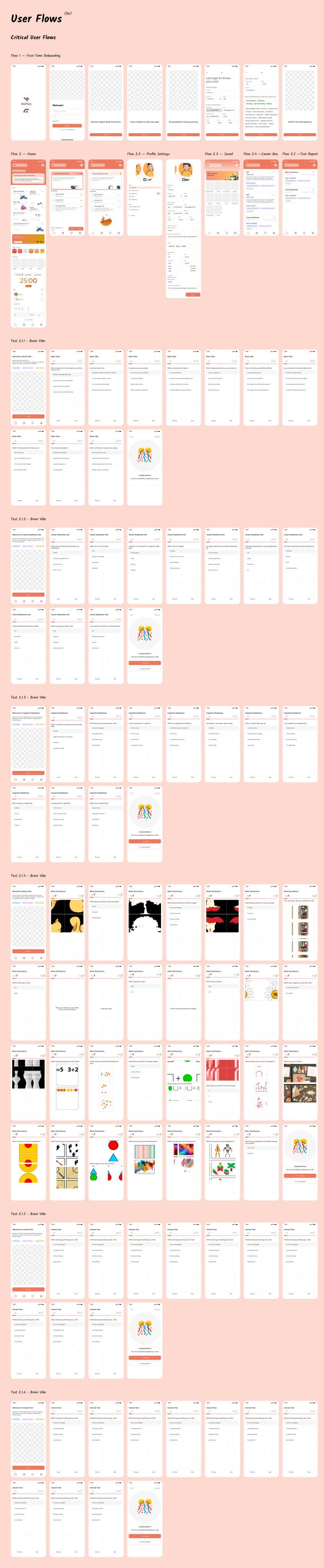
Design System
Component Library & Design System
A component library was built in Figma alongside the screen designs — not after. Working this way meant every design decision immediately became a reusable component, and handoff documentation was generated progressively rather than as a last-minute sprint.
| Category | Components | Notes |
|---|---|---|
| Foundations | Colour tokens, Typography scale, Spacing scale, Elevation, Iconography | Token-based; all values reference design tokens not raw values |
| Navigation | Bottom tab bar, App bar, Back navigation, Tab indicator | All states: default, active, disabled |
| Cards | Activity card, Career card, Mood card, Achievement card, Insight card | Expandable, skeleton loading states included |
| Inputs | Text field, Emoji selector, Tag selector, Card sort, Slider | All validation states, error messages |
| Feedback | Toast notifications, Progress bar, Streak counter, Achievement Success / warning / error / info variants badge | |
| Feedback | 4 emotional states × 3 sizes | Lottie specs and static PNG fallbacks |
Impact & Results
Outcomes & Impact
This is an ongoing project wrapping in March 2026. The metrics below reflect design outcomes, usability testing results, and concept validation signals — not post-launch analytics. These are the indicators measurable as a designer at the handoff stage.
Final Outcomes & Reflections
This is an ongoing project wrapping in March 2026. The metrics below reflect design outcomes, usability testing results, and concept validation signals — not post-launch analytics. These are the indicators measurable as a designer at the handoff stage.
Emotional design is structural, not decorative
The most important design decisions weren't colours or icons — they were architectural: keeping parent and student access separate, making mood check-in voluntary, holding results until all modules were complete. Each of these decisions protected the emotional safety of the experience.
Speed of onboarding is trust-building
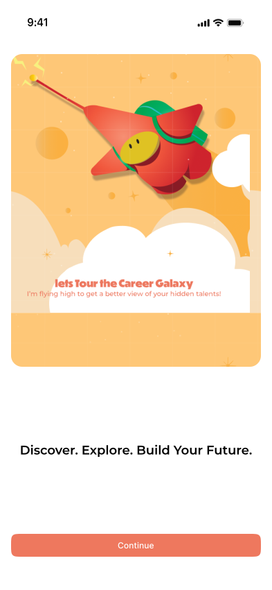
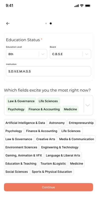
Every extra question in onboarding was a micro-moment of doubt. Removing 8 questions didn't reduce product quality — it dramatically increased the number of students who reached the actual product.
The hardest decisions were about removal
Several ideas that improved engagement on paper — instant feedback, visible progress, more choices — were deliberately excluded because they introduced pressure.
Fewer exploration paths led to faster commitment
Limiting choices in the explore section reduced hesitation — users moved forward instead of comparing options endlessly.
First-time users required less recovery
Fewer users restarted or abandoned flows due to confusion — indicating the structure was self-explanatory without external help.
34% drop in mid-flow abandonment
Restructuring the experience into a guided sequence shifted drop-offs to the entry stage instead of inside critical reflection moments.
Session behavior became less erratic
Session lengths stabilized across users instead of showing sharp drop-offs or spikes, pointing to a more controlled and understandable experience.
Exploration-to-action conversion improved
More users moved from browsing options to actually starting a module, reducing passive usage within the app.
Feature usage became more evenly distributed
Instead of one dominant feature, users engaged with multiple parts of the system, showing that the experience worked as a whole rather than in fragments.